library(ggplot2)
library(ggraph)
library(dplyr)
library(tidyr)
library(igraph)
library(purrr)
library(vroom)
library(paletteer)
library(easylayout)
library(UpSetR)
library(tinter)
library(here)
library(dplyr)3 Plotting Roots
3.1 Import libraries
3.2 Define functions
# Set colors
color_mappings <- c(
  "Olfactory transduction"   = "#8dd3c7",
  "Taste transduction"      = "#72874EFF",
  "Phototransduction"       = "#fb8072"
)

subset_graph_by_root <-
  function(geneplast_result, root_number, graph) {
    filtered <- geneplast_result %>%
      filter(root >= root_number) %>%
      pull(node)

    induced_subgraph(graph, which(V(graph)$name %in% filtered))
  }

adjust_color_by_root <- function(geneplast_result, root_number, graph) {
  filtered <- geneplast_result %>%
    filter(root == root_number) %>%
    pull(node)

  V(graph)$color <- ifelse(V(graph)$name %in% filtered, "black", "gray")
  return(graph)
}

# Configure graph colors by genes incrementation
subset_and_adjust_color_by_root <- function(geneplast_result, root_number, graph) {
  subgraph <- subset_graph_by_root(geneplast_result, root_number, graph)
  adjusted_graph <- adjust_color_by_root(geneplast_result, root_number, subgraph)
  return(adjusted_graph)
}

plot_network <- function(graph, title, nodelist, xlims, ylims, legend = "none") {

  # Generate color map
  source_statements <-
    colnames(nodelist)[10:length(nodelist)]

  color_mappings <- c(
    "Olfactory transduction"   = "#8dd3c7",
    "Taste transduction"      = "#72874EFF",
    "Phototransduction"       = "#fb8072"
  )

  vertices <- igraph::as_data_frame(graph, "vertices")

  ggraph:: ggraph(graph,
                  "manual",
                  x = V(graph)$x,
                  y = V(graph)$y) +
    ggraph::geom_edge_link0(edge_width = 1, color = "#90909020") +
    ggraph::geom_node_point(ggplot2::aes(color = I(V(graph)$color)), size = 2) +
    scatterpie::geom_scatterpie(
      aes(x=x, y=y, r=18),
      cols = source_statements,
      data = vertices[rownames(vertices) %in% V(graph)$name[V(graph)$color == "black"],],
      colour = NA,
      pie_scale = 1
    ) +
    geom_node_text(aes(label = ifelse(V(graph)$color == "black", V(graph)$queryItem, NA)),
                   nudge_x = 1, nudge_y = 1, size = 0.5, colour = "black") +
    ggplot2::scale_fill_manual(values = color_mappings, drop = FALSE) +
    ggplot2::coord_fixed() +
    ggplot2::scale_x_continuous(limits = xlims) +
    ggplot2::scale_y_continuous(limits = ylims) +
    ggplot2::theme_void() +
    ggplot2::theme(
      legend.position = legend,
      legend.key.size = ggplot2::unit(0.5, 'cm'),
      legend.key.height = ggplot2::unit(0.5, 'cm'),
      legend.key.width = ggplot2::unit(0.5, 'cm'),
      legend.title = ggplot2::element_text(size=6),
      legend.text = ggplot2::element_text(size=6),
      panel.border = ggplot2::element_rect(
        colour = "#161616",
        fill = NA,
        linewidth = 1
      ),
      plot.title = ggplot2::element_text(size = 8, face = "bold")
    ) +
    ggplot2::guides(
      color = "none",
      fill = "none"
    ) +
    ggplot2::labs(fill = "Source:", title = title)
}
3.3 Loading necessary tables
#Load data (need to save tables from first qmd)
nodelist <- vroom::vroom(file = here("data/nodelist.csv"), delim = ",")
string_edgelist <- vroom::vroom(file = here("data/string_edgelist.csv"), delim = ",")
merged_paths <- vroom::vroom(file = here("data/merged_paths.csv"), delim = ",")
3.4 1. Visualization with UpSet Plot
The UpSet Plot is a useful tool to visualize the distribution and concatenation of genes between different metabolic pathways. It allows identifying how genes are shared or exclusive among the analyzed categories.
upset(dplyr::select(as.data.frame(nodelist),
                            "Olfactory transduction",
                            "Taste transduction",
                            "Phototransduction"),
                    nsets = 50, nintersects = NA,
      sets.bar.color = c("#8dd3c7", "#72874EFF", "#fb8072"),
      mainbar.y.label = "Biological Process \nIntersections",
      sets.x.label = "Set Size")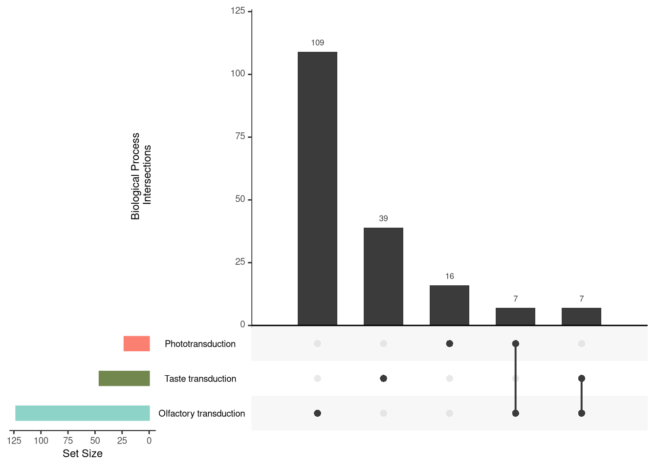
3.5 2. Visualization of the Protein-Protein Interaction Network
The visualization of the interaction network is essential to understand the functional connections between proteins. Here, we use the easylayout package, developed by Danilo Imparato, to generate an efficient layout. This package organizes the network nodes in x and y coordinates, allowing a structured and clear visualization. Subsequently, the graph will be plotted with ggraph.
## Graph Build
#graph <-
#  graph_from_data_frame(string_edgelist, directed = FALSE, vertices = nodelist)

#layout <- easylayout::easylayout(graph)
#V(graph)$x <- layout[, 1]
#V(graph)$y <- layout[, 2]

#save(graph, file = "../data/graph_layout")
3.5.1 2.1. Visualization of the Ancestry of Each Node
The analysis of the ancestry of each node in the network provides an evolutionary view of the analyzed proteins. Here, we use ggraph to plot the graph with the positions previously saved by easylayout.
The nodes are colored according to the distance from the last common ancestor (LCA) of the analyzed clades and the human (Human-LCA). The darker shade indicates older clades in relation to humans, while light shades of blue represent newer clades, closer to the Human-LCA.
load(here("data/graph_layout"))

ggraph(graph, "manual", x = V(graph)$x, y = V(graph)$y) +
  geom_edge_link0(color = "#90909020") +
  geom_node_point(aes(color = -root), size = 2) +
  theme_void() +
  theme(legend.position = "left")
3.5.2 2.2. Visualization of the Protein-Protein Interaction Network in Human
To better understand the relationship between human proteins, we plot the interaction network where the nodes represent the human genes associated with their biological processes.
3.5.2.1 Description of the graph elements:
- Nodes (Circles): The colors of the nodes are divided according to the biological processes assigned to each gene. The use of pie charts allows the visualization of genes that participate in multiple processes.
- Edges (Lines): Represent the protein interactions based on data from STRINGdb.
- Gene labels: Each node is annotated with the corresponding gene symbol, strategically positioned for easy reading.
## Plotting Human PPI Network
#ppi_labaled <-
ggraph::ggraph(graph,
               "manual",
               x = V(graph)$x,
               y = V(graph)$y) +
  ggraph:: geom_edge_link0(edge_width = 0.5, color = "#90909020") +
  scatterpie::geom_scatterpie(
    cols = colnames(nodelist[10:12]),
    data = igraph::as_data_frame(graph, "vertices"),
    colour = NA,
    pie_scale = 0.40
  ) +
  geom_node_text(aes(label = nodelist$queryItem), colour = "black", nudge_x = 0.8, nudge_y = 0.8, size = 2) +
  ggplot2::scale_fill_manual(values = color_mappings, drop = FALSE)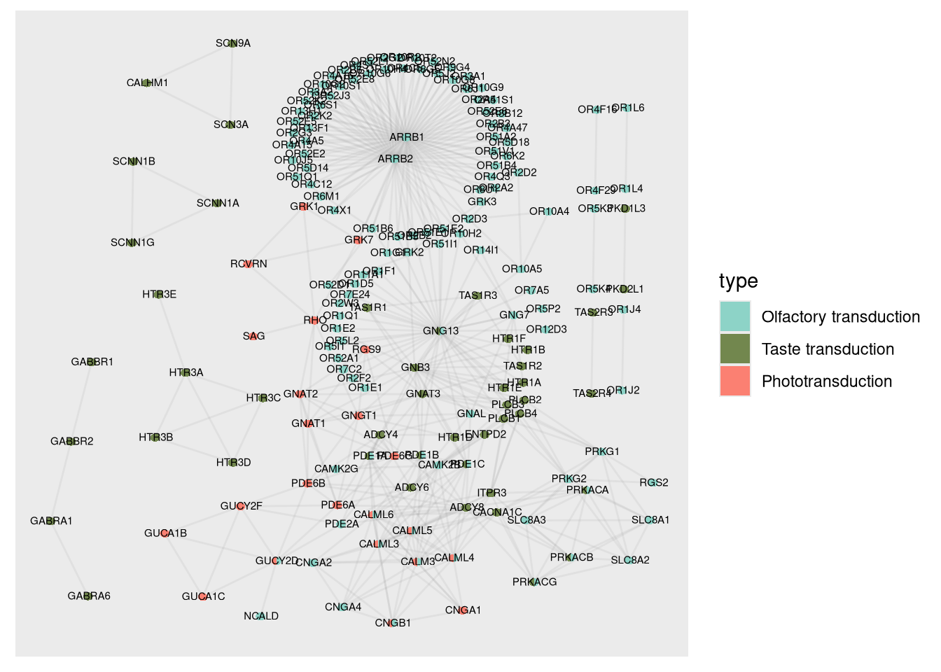
#ppi <-
  ggraph::ggraph(graph,
               "manual",
               x = V(graph)$x,
               y = V(graph)$y) +
  ggraph:: geom_edge_link0(edge_width = 0.5, color = "#90909020") +
  scatterpie::geom_scatterpie(
    cols = colnames(nodelist[10:12]),
    data = igraph::as_data_frame(graph, "vertices"),
    colour = NA,
    pie_scale = 0.40
  ) +
  ggplot2::scale_fill_manual(values = color_mappings, drop = FALSE)
3.5.3 2.3. Visualization of the Protein-Protein Interaction Network in Each Clade
In this section, we visualize the genes that are statistically rooted in each clade. The arrangement of the genes allows us to observe the increment of orthologous genes as a function of the complexity and antiquity of the biological system.
3.5.3.1 Visualization features:
- Evolution of the graphs: The graphs are organized from left to right and from top to bottom, allowing the analysis of the evolutionary progression.
- Node coloring: The color of the nodes indicates the level of ancestry, as previously highlighted, where darker tones represent older clades and lighter tones indicate evolutionary proximity to humans.
- Organisms of interest: In addition to visualizing all clades, it is possible to generate graphs focused only on certain groups, such as Metamonada, Choanoflagellata, Cephalochordata, and Amphibia.
With these visualizations, it is possible to identify patterns of gene evolution in different clades and perform detailed comparisons with organisms of specific interest.
geneplast_roots <- merged_paths[order(merged_paths$root), ]


buffer <- c(-50, 50)
xlims <- ceiling(range(V(graph)$x)) + buffer
ylims <- ceiling(range(V(graph)$y)) + buffer

roots <- unique(geneplast_roots$root) %>%
  set_names(unique(geneplast_roots$clade_name))

# Subset graphs by LCAs
subsets <-
  map(roots, ~ subset_and_adjust_color_by_root(geneplast_roots, .x, graph))

# Plot titles
titles <- names(roots)

plots <-
  map2(
    subsets,
    titles,
    plot_network,
    nodelist = nodelist,
    xlims = xlims,
    ylims = ylims,
    legend = "right"
  ) %>%
  discard(is.null)

#net_all_roots <-
patchwork::wrap_plots(
  rev(plots),
  nrow = 4,
  ncol = 4
)
#ggsave(file = "../data/network_rooting.svg", plot=net_all_roots, width=10, height=8)patchwork::wrap_plots(
plots$Metamonada, plots$Choanoflagellata, plots$Cephalochordata, plots$Amphibia,
ncol = 4
)